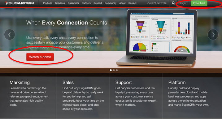
CTA’s are most recognizable as buttons on a webpage used to compel visitors to take specific actions
A Call To Action or CTA is happy marriage between marketing strategy and design. It is a familiar and commonly used marketing tactic – you probably just didn’t know it has its own acronym.
A CTA is not a new concept; just think of all the infomercials that told you to “Call Now!” But because the Internet is so full of information and users’ attention spans are decreasing, it is important to use CTA’s to ensure key parts of your website quickly draw attention.
CTA’s are most commonly used as buttons to encourage an action. “Watch a Demo”, “Read More”, “Contact Us” and the list goes on. The intention is to move visitors through the sales funnel and increase website conversion.
CTA’s are under utilized as a tool to highlight key information on a page and to quickly draw visitors deeper into your website.
These two examples are both Vancouver, BC based financial planning companies. The Granville West Group has a typical corporate homepage and even uses CTA’s (“Ask an Expert” and “Contact Us”) but their informational CTA’s are not compelling. What they’ve highlighted doesn’t promptly answer any key questions a potential client might have.
In contrast, Elementus Wealth Management uses Call to Actions to answer questions which draws visitors deeper into the website. When looking for a professional, especially one in a competitive industry, your number one question is “why pick you?” Here, the company addresses that by using 3 Call to Actions and each one appeals to a different type of person; there is the typical ‘about us’, a video for visual people and a top 5 for the direct types.
When properly set up, Call to Actions also improve the measurability of your website by showing what visitors have clicked. The simplest way to review this is with Google Analytics’ visitor flow tool which tracks how visitors progress through your website. A more precise way to measure CTA clicks is to set up event tracking on Google Analytics. The set up is a little more complicated but the data generated is more accurate and easier to analyze.

Here’s an example from a Vancouver hotel. Of course, it is important to present why this hotel is a great place to stay. But the most important action taken on this website is to generate bookings.
It is important to create focus on your website. Incorporating Call to Actions on your website will direct visitors to key information or actions and draw them deeper into your website. This will increase engagement and conversion on your website if done properly. Guaranteed SEO offers an array of internet marketing services that includes website analysis. Our experts will identify opportunities to place CTA on the website to maximize leads.