Not too long ago Google announced that over 50% of the searches that were being performed on the Google search engines were being accessed by mobile devices – meaning smartphones and tablets. This is been a long growing trend and it’s not going to stop; meaning mobile is more important than ever if you want to get found online.
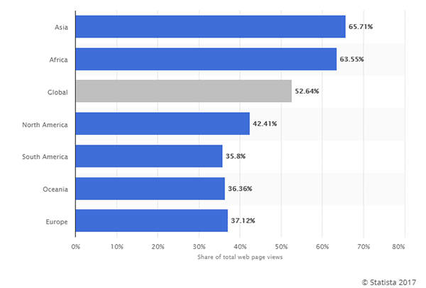
Your customers are looking for you while they’re out doing things, and if your website isn’t mobile-friendly you are losing business opportunities, possibly ones that are sitting right outside your door.
Your online marketing must consider mobile users and effectively provide them with an experience that they find valuable. You need to have a site that looks attractive and is usable on a smartphone or a tablet, not just a desktop. If you don’t you’re missing between a third and two-thirds of the business that might be out there.
In a highly connected world, people are taking advantage of the immediate search capabilities that are built into their phones to find what they want, when they want it, where they want it. Think of your own day-to-day life how many times do you pick up your phone and Google something?
While 3 or 4 years ago it might have been a fairly rare occasion that you resorted to looking for something on your smartphone, now for most of us it’s a daily occurrence. Younger audiences can be on their smartphone looking for information dozens of times per day. That said, don’t count out the seniors as more and more of them are going online and are becoming proficient users of mobile search devices. This makes it even more important to make sure they can read what’s on the mobile device screen because older eyes are not as sharp as they once were. It’s all part of providing a valuable and usable mobile experience.
So what are some steps you can take to make sure that your mobile site is user-friendly and effective with the search engines? At Guaranteed SEO we recommend the following tips as a great starting place but there are lots more you can and should do.
Responsive design is not a single thing, it’s a concept that involves content, design, and careful thought about the layout and what is going to be presented where on any given device. It’s a way of crafting a unique user experience that is suited to the device the consumer is using.
By making sure your site is responsive you are able to make sure that the user enjoys the best experience for whichever device that they’re using to visit your site. Responsive Design ensures that the way it is laid out, the size of the fonts and placement of images and key calls to action (CTAs) are optimized for the device being used. Thus no matter if it’s a rather small screen on a smartphone a medium size screen on a tablet or a full laptop desktop experience, the user is seeing what you want them too and not frustrated because they cannot read the page or have to zoom in and navigate around to find what they want. Patience may be a virtue but it is in short supply when it comes to poorly laid out or unresponsive mobile websites. You may have a better product or a better business but if it’s not getting looked at because people are angry they cannot see it on their smartphone then you are going nowhere fast as far as online sales and marketing are concerned.
Google if recently announced that page load speed is formally part of the metric that they use to determine whether a site is delivering good user experience and that’s how it will be ranked in short people will not wait for a slow-loading page on a website and will leave it and Google will notice this I drank your page accordingly.
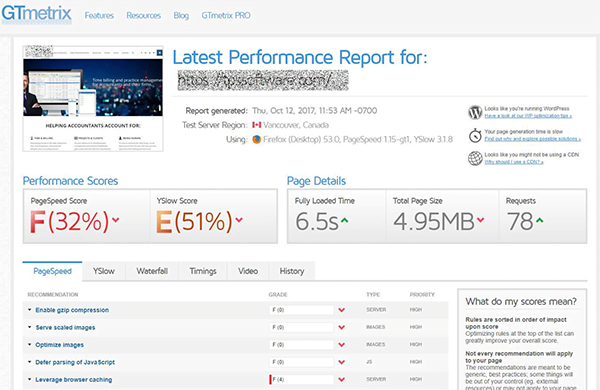
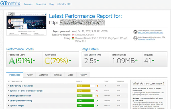
before/after Guaranteedseo optimization
This becomes even more important when using mobile devices because the intricacies of cell networks Wireless and less processor power of many devices means that a page can load slower on a mobile device if it is not carefully optimized for that device. Thus it is important that your developers make sure that they have done everything possible to make sure that I’m up I’ll page loads as fast or faster than its desktop companion.
Studies have shown that a page load speed of greater than 3 seconds will cause a significant rate of Abandonment – a lost opportunity for your website.
Slow Pages cost you leads and conversions.
There are however some easy steps that you can take to ensure that your site loads faster and makes the 3 seconds gate.
Google’s Accelerated Mobile Pages or AMP is a recent initiative that provides faster mobile page load speeds at a better user experience for mobile users. The pages look much the same as on a normal HTML web page but load much much quicker. There are some compromises and some items that you may wish to have on your site may or may not be supported so it may not be possible to use have pages for all your responsive and mobile needs but where you can it’s certainly worth considering.
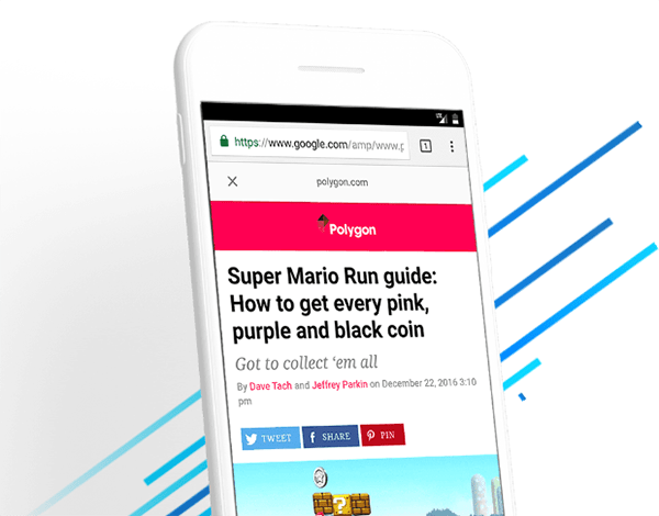
Google AMP pages are fast and attractively laid out but only for mobile!
Basically, Google achieves the faster loading speed and better browsing experience in AMP by incorporating simpler forms of client-side scripting so while you can still use HTML CSS and JavaScript on your site, using AMP means you will be using particular AMP versions which are “slimmed down” to load much faster than standard libraries. Using AMP is sort of like putting your web pages on a harsh training regime to get lean and mean so that they can display on mobile devices as quickly as possible.
As part of the experience, Google also caches the AMP pages in the cloud just providing even faster loads beats that would be the case if they were coming directly from your server. one significant advantage of using empty pages is that generally include improved search engine rankings in mobile search listings. F is a relatively new technology it is evolving all the time so we expect to see improvements and added functionality, but even at this point in time which strongly recommended for many websites, particular things like mobile blog posts and pages with simple written content.
The reality is that mobile devices are different than desktop devices and consumers use them differently. Thus techniques and methodologies that you use to optimize for a mobile device may vary from what’s done for the desktop.
The first consideration is that most mobile searches are conducted by people looking for local points of interest be they stores, ATM’s, offices etc. They are conducted near something frequently by people who are on the move. You need to make sure that you have done a good job of doing local SEO which will help the consumer find relevant information about your site products at listings in relationship to where they are at the time that they’re searching. Showing a consumer a store in a different city instead of the one 5 KM from them is not likely to impress.
The second consideration is that mobile keywords and searches as typically entered can vary and be different from desktop. People take shortcuts when they’re typing on a smaller mobile device. Figuring out the terms that customers are using to find you is even more important in mobile because people have less time available and less tolerance for inaccurate or unhelpful results. One interesting development is that increasingly users are taking advantage of voice search as a means of entering their search queries. A recent study showed that over 40% of mobile users have embraced voice search and are using Technologies like Siri or Google to enter in queries for product directions etc. if you want to earn their business then you need to show up for these search queries.
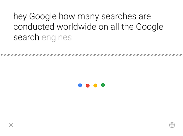
You can ask Google a question by voice input.
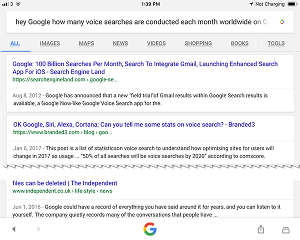
And receive both an audio and traditional SERP list as a result
This means you need to optimize using conversational search queries. You need to answer questions about your content so that Google can recognize that there’s valid content in relation to a voice query. You need to use a structured mark update at the help the search engines understand your product and services better.
A very effective technique that has worked for a lot of our clients is creating an FAQ page about your product or services. This is 2 benefits because it will help the consumer understand what your product and services and to Google will recognize the value of your content in a well-constructed FAQ and quite often place it high up in a search results page, faster than a page of regular content.
Lastly, maximize your company’s visibility in the search engines by creating a Google My Business listing. This free service from Google gets a considerable number of eyeballs on it and could be a very effective way of generating traffic for your website. In addition, you will want to make sure that you have your Google Map listing and your Google Plus listings optimized and synced so that the information is accurate and up to date. Changed Addresses or phone numbers? Make sure your data is updated online too for each and every place you are listed.
We hope you have found this post interesting, please let us know if you did or if you think we missed something. If you are interested in learning how to improve your website’s mobile performance please ask for a quote or give us a call today at 1-866-588-8282.
