In case you haven’t already heard, Google is rolling out a new “mobile friendly” update to its search results ranking algorithm. The update launches April 21, 2015, and the search company predicts that it will have a major impact on where individual sites rank on their Search Engine Results Pages or SERP.
For webmasters who rely on search traffic to power their websites, this is a giant change and one that is likely to make and break more than a few web businesses, based on how they handle the update. If you have been in online commerce long, you no doubt remember past algorithm updates, like Panda and Penguin, and the impact they had on your site’s locations on a SERP.
According to analysts who work for the search giant, this latest update will shake up the rankings even more than those previous rollouts.
To help you understand what this update means and how you can prepare for it, here is a brief overview of how it will work.
First, the mobile friendly change will only affect mobile search results, meaning results shown on phones, small-screen tablets, and similar low resolution devices. Users on desktops should see the same results as before and after the update, although if your site decreases in visibility on mobile devices, that may hurt its desktop rankings over the long haul. The crux of the change is that after the
The crux of the change is that after the roll out, sites that the search engine deems compatible with mobile devices will receive a boost in their rankings. Sites that aren’t will be comparatively penalized. The search engine will determine automatically whether a site is mobile compatible, and that determination isn’t made on a sliding scale. Your site either will be “mobile ready” or not. Although the scheduled launch date for the update is April 21, those coordinating the launch have cautioned not to expect any instantaneous changes. This is a worldwide
Although the scheduled launch date for the update is April 21, those coordinating the launch have cautioned not to expect any instantaneous changes. This is a worldwide rollout, and may take up to a week to complete. Once it is entirely finished, there will be an announcement, and at that point, any changes to your site’s rankings should be evident.
If you are concerned about this update, then the question to ask yourself, is whether or not your site has a responsive design.
If the answer to that question is no, then you will need to adjust, or expect a downturn in your search traffic. Responsive design is not a new concept by any means. Those in the web profession have been aware of the need for mobile-ready sites for at least a decade, and the response has been status quo among professional designers and developers for three or four years now. That means there is an excellent chance your site is currently mobile ready, and that no changes are necessary.
If for example, your site runs any of the popular WordPress themes released in the last two or three years, odds are good that it is responsive. The same goes for anyone running a site on a major third-party hosting platform, like Squarespace, Weebly, or Tumblr.
If you are not certain whether your site qualifies as mobile ready, then you should check out the testing tool that launched in advance of this update. Visit Webmaster Tools and load the mobile-ready diagnostic page.
Enter your site’s URL and, in a matter of seconds, the tool will tell you whether or not you qualify as mobile ready under the coming update. If not, you’ll definitely want to bookmark the tool for future testing. Rather than caching results, the page tests your site a new every single time it is loaded, so if you’re attempting to make your site responsive, the page can give you instant feedback on how you are faring.
If you aren’t ready for the update, then you may want to make changes to get your site ready between now and April 21. To help you do that, here is a quick intro to the fundamentals of mobile design, and some tips for becoming mobile-ready as fast as possible.
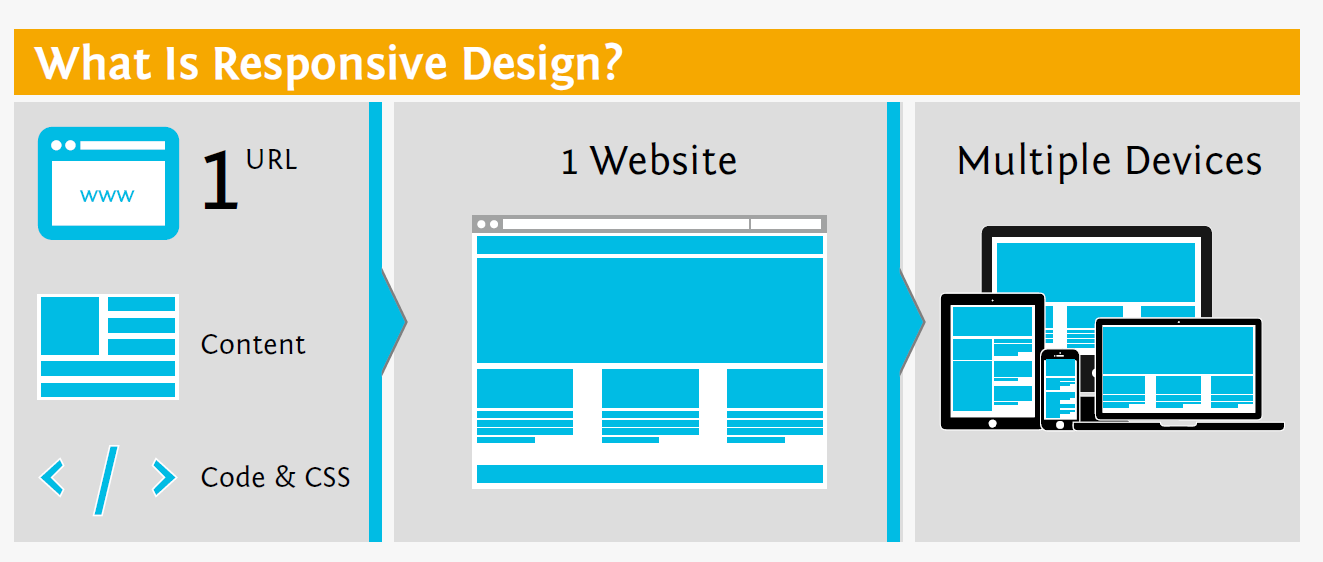
Responsive Web design allows you to have 1 URL, one set of content and one code base and yet make a website that looks great and operates well on a wide variety of devices.
If you aren’t already clear on what makes a good mobile site, the best way to learn is to get your phone and load a major mobile page, like NYTimes.com or ESPN.com.
Once you have these loaded, look at how they differ from typical websites. The text is larger, with more spacing between lines, and of course it wraps at the edges of your screen. Buttons and links are also larger, which makes them easier to click. Not only are buttons and other “tappable” elements larger, but they also have more space between them so that users don’t accidentally tap the wrong one.
In these ways, mobile sites understand the differences between surfing the web on a phone and doing so on a desktop and they adapt to make surfing on a phone as easy as possible.
If you’ve ever loaded a non-responsive site on your phone, you know how frustrating it is to constantly zoom in and out to make text and images visible, or to tap ten times before you actually hit a link. The new update is intended to spare users those frustrations.
If your site requires some work before it’s ready for mobile, the good news is that the changes you need to make aren’t necessarily that difficult. Sites with simple layouts, like blogs and even some e-commerce pages, can become mobile ready just by adding a few media queries to your CSS and adapting the CSS rules for body text, links, headings, and images.
On the other hand, a complex site with many different layout templates or complicated features can be very challenging (and expensive) to make mobile-ready. If you have such a site, then your best bet might be finding a mobile theme (whether for WordPress or just HTML) and adapting it to work with your existing page elements.
But even that can be a complicated process, and difficult to finish before 21 April. As Google would tell you, responsive design has been the standard for a long time now, and they no longer feel like they need to give sites time to play catch up.
If you simply want to find out if your site is ready for Google’s Mobile update, give us a call. In less than 5 minutes we can let you know and give you some free tips on how to improve it. If it’s not going to be up to snuff then treat it as a great opportunity to update your site.
Once again, we are happy to help and can provide a free quote on building you a mobile site, or an entirely new responsive site. You can check our portfolio or call us 1-866-588-8282!