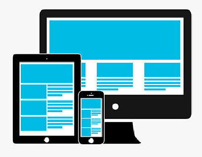
Solid website designs, especially in our smartphone-driven media environment, are conducive to more traffic, better user retention, and increased conversions for businesses. It is not enough these days to have a “one website design fits all” mentality. Given that there a multitude of platforms on which we can browse the web, including desktops, laptops, tablets, and phones (and even Smart TVs!), it should be rather obvious to website designers that their responsive websites should be presented in the ideal format with respect to the medium in which they are being viewed.
With each iteration of the latest digital products, the aspect ratios and presentation parameters of new technology changes. Therefore, the way responsive websites are presented on these new technologies must change as well. More and more online entities and the visionaries that lead them are placing priority on responsive design over other aspects of their digital business. Although it isn’t yet considered mandatory by site owners, responsive web design promotes greater usability, which in turn increases the traffic; and since Google has included mobile responsiveness as one of their criteria that affects ranking, there is no doubt that this practice must be adopted by those domains that wish to thrive in the Search Engine Ranking Pages (SERPs). The advent of newer mobile technologies will undoubtedly usher in the need to make responsive web design a must-have or new online business; if you’re thinking of starting an e-commerce site, be prepared to go mobile – or have your website die on the desktop (but we’d rather you not!).
If you’re set on getting a responsive website up to spec for the modern digital age and for better performance on the search engines, there are several design types you can choose from. Depending on the resources available to you, choose which one is best suited to your needs and goal.
Adaptive Responsive Design allows you to implement a set of code specific to each device viewing the website. You can even adjust the screen size to your choosing, scaling down for smaller devices in order for quicker loading times. Web design criteria will need to be set at the beginning in order for the site to be adaptive enough to meet the needs of different kinds of technology.
CSS Responsive Design automatically detects the device the website is being viewed on as well as the screen size, delivering a specific set of code for each medium. The benefit of using this web design technique is that you can optimize your site to have completely different features from one device to the other. For example, the smartphone version of the responsive website would have drop-down buttons where the desktop version would have none. This could be extremely useful if your website’s users have habits indigenous to a certain device. Responsive web design improves the user experience significantly which can, with time, improve your rankings in search engines. More visibility will translate into more traffic.
Finally, pure Responsive Design only has one code set that is used across all manner of devices. All of the website’s elements are universal and managed by CSS styling. Having stylesheets with appropriate media queries judge how a page shows up on any device, regardless of its screen size.


Those who are considering investing in making their websites with a responsive web design should do their research on how their website visitors and customers consume their media. You might also want to look into what your competitors are doing and how their consumers are viewing their sites. Allocating a budget towards each stage of the process depends on what kinds of devices to which you’d like to tailor your responsive website design. It wouldn’t be prudent to try and include everything, as you may end up investing in features that’ll most probably be abandoned down the line. Responsive web design, combined with effective SEO in Vancouver, allows you to display or hide content on specific screen sizes so you can have your visitors focus on the most important content on each page. In the long run, you’ll benefit from having higher conversion rates due to the ease of use of your responsive web pages.
Responsive design has many positives, including increasing your mobile visibility in the search engines and, in turn, growing your revenue. Since Google search engine page result rankings now consider mobile-optimization as a factor in their algorithm, this could impact your site for the better. Creating a unified brand experience on your website, across all devices, allows visitors to navigate your pages with ease and, with due diligence, pay for itself. With smartphone and tablet traffic increasing year over year, investing in a responsive website is a no-brainer – so get the most out of your website by making it universal!
